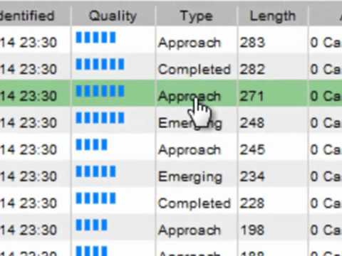
Subtitles section Play video Print subtitles hello and welcome, the purpose of this short video is simply to show you that overall layout the autochartist application and to help you navigate around to be able to make sense of what you're looking at. when you log in and start up the application, your eye will naturally fall on the price graph. it was intentional to make this prominent because all of the trade opportunities that autochartist identifies are visual. the stories are told by pictures. you can get a clearer image by clicking on the price graph for an enlarged view. Note that these images are static. you can download them and save them and share them with your colleagues . every time you request the image it will be updated with new price data, as time goes by you'll see the price graph grow. but more about this in just a minute, for more information about specific pattern types, see the educational video that described each separate type of trading opportunity.their is one called chart patterns, one for fibonacci patterns and one for key levels. This graph is the display of whatever is listed in the grid below. if you can item it is displayed up here. all types of opportunities can be included in this list. in the search list different psttern types are distinguished by a small icon next to the pattern name, as well as the type column that shows whether they are completed or emerging breakouts or approaches. you can selectively choose which analysis types you went to include in your search through this results filter here at the top of the grid. if your results filters is not showing, simply click on this link over here and it will expand. results in the grid are sorted according to age by default. the age column indicates the number of candles that have formed after the pattern has been identified. now, getting back to the static images that update. here you can see the line of when the pattern was originally identified. since then at least an hour has past and two more thirty-minute candles have been added to the graph. Hence it has an age of 2. They are outlined in colour, but not filled. The fact that each candle represents 30 minutes is indicated by the Interval column. You will also note that there are two grids. the one contains only active trading opportunities meaning, pattern that can still be useful for a trader. As soon as a pattern reaches its target level, it will be moved to the other tab, containing expired trading opportunities. These are opportunities that came and went, either because the target was reached or because the price graph didn't continue in the expected direction. Now, watch our next video on setting up your own search groups. And send us your feedback and question to support@autochartist.com thank you for watching -
B1 US graph pattern price column grid trading Autochartist Quick Tour 126 5 Shang Kuo Chang posted on 2016/03/01 More Share Save Report Video vocabulary