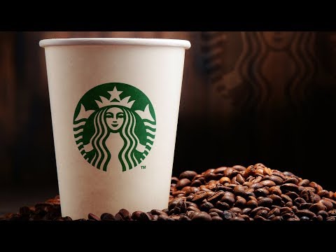
Subtitles section Play video Print subtitles (upbeat music) - [Narrator] Her eyes command a warm confidence, her hair ripples as an ocean wave that laps provocatively over her chest. As the face of Starbucks since 2011 the siren logo is alluring by design. Beckoning you into the store to grab a latte or a pastry. Her face is so perfect it's its own mirror, with the left and right sides copied to match up like a Rorschach test. She's beautiful and of course she's beautiful because her face looks like its' a piece of perfect symmetry. And we've long studied symmetry as the defining trait of beauty. But the secret you've probably never noticed about the sire is that while her features look symmetrical, they're actually asymmetrical. Look at the right side of her nose and you'll see a shadow that sort of dips a little bit lower. I talked to Lippincott who actually developed this logo for Starbucks in 2011 and it's a pretty funny story. Lippincott's job was to rethink this logo and they decided, along with Starbucks, to break the siren out and to make her the focal point. When they were doing that they decided they had to also make her more perfect. If she was going to be zoomed in in her big close up on the cover of packaging, on the front of stores, they wanted her to be perfect. So they slowly started refining her face to be perfect. They made it a little bit skinnier, a little more model like, and eventually they really did succeed in making her perfect and they had her up on the wall alongside many different iterations and they couldn't figure out why her face just sort of looked like a dead mask. She didn't look friendly, she looked a little bit creepy. She looked a little bit like a pseudo person. What the designers realized was they'd made a mistake, they'd made her too symmetrical. So what they did was they went back to the drawing board, they added a little bit more curve to the entire design, but they really focused on the shadow of the face and adding just a little bit of asymmetry. Honestly it's just a few pixels in a logo, but look at it and it makes all the difference in the world. (upbeat music)
B2 US logo perfect symmetrical symmetry siren shadow The Secret Story Behind The Starbucks Logo 382 14 minami.kuo posted on 2019/12/16 More Share Save Report Video vocabulary