Subtitles section Play video
So, we've all seen "Wonder Woman" by now, right?
I really like it and I wanted to do this quick little sort of
mini video essay to talk about
one aspect of it
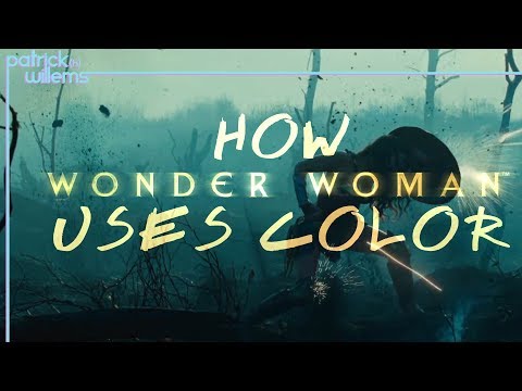
the colour
and yes, I know, it's me talking about colour and
superhero movies again but as positively as
"Wonder Woman" has been received, I have seen a lot of people talking about
it as having the same dull muted look as the
other DC movies which I think is inaccurate.
See this movie uses colour better and
more deliberately than, not just the other DC movies, but
than any other superhero movie in years.
So let's talk about that.
As I've said before, I think the
Zack Snyder DC movies objectively
look good since he's a brilliant visual stylist
but for movies about Superman,
a character who is supposed to represent hope,
I think the desaturated, sombre colour pallet
is a poor choice
but that's Snyder's aesthetic and it's going to be applied
to any movie he makes.
"Suicide squad", I think actually has good
cinematography and bathing the visuals
in sickly, yellowish hues works well for a
movie about supervillains,
but let's look at what "Wonder Woman" does.
And the spoilers are going to be very light here, so like
Spoiler Alert, she's alive at the end of the movie.
The whole first act is set on Themyscira
and the colours there are richer and more vibrant
than anything we've seen in the other DC films
it's full of warm skin tones, deep blues of the
ocean and sky and lush green everywhere.
It's beautiful and full of colour.
Then she accompanies Steve Trevor
to England and encounters 'Man's World' for the first time
and the whole look changes.
Everything is bleak and grey
and shown in cold bluish hues
and immediately upon arriving Diana remarks
"It's hideous."
So now we're seeing a look similar to the Snyder movies,
except this time it's motivated, providing a sharp
contrast between the Amazonian paradise and
the shitty world men have made.
In an interview last week with Elvis Mitchell
on "The Treatment" here's what director Patty Jenkins
had to say about the colour
"In the opening it's all colour,
right, it's every colour, and that is life
and that is beauty and if we were living a balanced life,
and that is always what I loved about Themyscira,
and so I loved that about that world, and then what was
interesting is when we got into, em, 'Man's World',
I didn't want there to be an overwhelming array of
colour, 'Man's World' is much more
limited, controlled, it's, it's within a smaller
pocket, so there's actually a lot of colour but the colour
is only blue, grey, not green."
But it gets more interesting when we get to the
already iconic 'No man's land' scene.
This is the classic moment in any
superhero origin movie where the hero
makes their public debut, making the choice to
step forward and help people.
All of 'No man's land' is portrayed as bleak and miserable
and cold.
Even the clothes the men wear are drab
blending into the environment.
So look at Diana as she steps out onto the battlefield,
her skin tones are warm,
the red of her costume is vibrant.
She's a beacon of hope and warmth
standing out against the cold misery of this wasteland.
Compare this to her visual presentation
in "Batman v Superman",
where all the colours were so muted that you
couldn't even tell her costume was red.
Everything is just a bunch of brown.
Now this continues through the action sequence,
especially, as she takes out the Lasso of Truth
which provides this bright beam of light
cutting through the darkness.
And after this battle ends, and the town has been saved,
the colour pallet changes, it's now shown in
warm yellows and oranges.
Diana has literally restored light to the town.
Okay, I'm jumping back in here because
there's no available footage to use for reference
for this next part, so in the next scene,
set the following morning, we now see the town
bathed in this warm sunlight.
And this same idea with the colour
shows up in the final scene of the movie,
set in the present day,
where we see Wonder Woman looking out over
Paris which is lit up
by this bright golden sunset.
The colours here, compared to the blues that had
previously covered the landscape, are telling us that
Diana's presence has brought hope and a
warmth to the world and there really was
a brighter tomorrow.
Look, this is not especially complicated
but it's effective.
Patty Jenkins is using colour as a storytelling device
which is something I wish I would
see in more comic book movies.
So don't complain that it's another
drab DC movie, when all the colours are
thematically motivated.
And as for the movie itself, because people keep asking
me, I really like it, and I am so happy to report
that it accomplished the main thing I was hoping for.
It gave us a hero with clear motivations and goals
who learned and made discoveries and grew and
had a clear arc over the course of the movie.
Of all the things the movie did well, the most important
was getting Diana right.
And now, I am excited to see more movies about her.
By the way, this week's regular video will be
coming in a couple of days. If you want to help us make
more of these things, check out the Patreon.
If you wanna get up into what we're working on and
yell at me about stuff, check out the
media links, and I will see you on
Wednesday,
probably.